Start with the artwork
A mat is more than the border between an image and its frame. It creates visual breathing room, establishes a sense of scale, and directs the eye toward the art rather than the moulding. A good starting point is to look at the artwork in natural light and identify the tones you want to emphasize. A drawing with delicate graphite marks calls for a different approach from a saturated photograph or a bold contemporary print.
Set the art against a few physical mat samples rather than relying on a screen. Small shifts between ivory, warm white, gray and muted color become much clearer when the samples sit next to the piece. Look at the entire composition, not just one corner or the brightest area. The mat should support the image's character without making it feel boxed in.
Decide whether the mat should blend or contrast
Warm whites and soft neutrals are popular because they allow the work to remain the focal point, but there is no universal best color. A white mat against a warm, aging paper ground can appear stark; an ivory or cream may feel calmer. A charcoal mat can lend definition to a black-and-white photograph, but a very dark surround can also alter how the midtones appear to your eye.
Use contrast with intention. Try one sample close to the artwork's paper tone and a second that picks up a subtle color within the image. Compare both from several feet away. The goal is not to match everything perfectly. It is to find a relationship that feels settled, appropriate to the artwork and comfortable in the space where it will hang.
Give the picture enough room
Mat width changes the perceived scale of a framed piece. A narrow border can make a small image feel cramped, especially with a visually strong moulding. A broader border often gives fine details and quiet compositions room to breathe. But overly generous matting can overwhelm the subject, particularly when the print is already small or the wall space is limited.
Instead of choosing width from a fixed rule, lay out a few proportions and see how the art responds. Pay attention to the overall outside dimensions as well as the visible image. Some compositions benefit from a subtle additional lower margin, while others feel best with balanced borders. A framing consultation is an opportunity to see these options at actual scale before committing.
Understand the purpose of a window mat
A window mat can keep glazing from resting directly against the face of suitable flat artwork. That separation is especially relevant for works on paper and some photographic processes. The best construction depends on the object's condition, media and long-term display goals. Fragile, valuable or unusual objects may require advice from a conservator rather than a standard framing approach.
Ask what materials will touch the artwork and how the piece will be supported behind the window opening. A visually attractive border does not by itself establish that a framing package is appropriate for long-term preservation. Stable, suitable materials and careful handling matter as much as the mat's color and shape.
Consider layered mats carefully
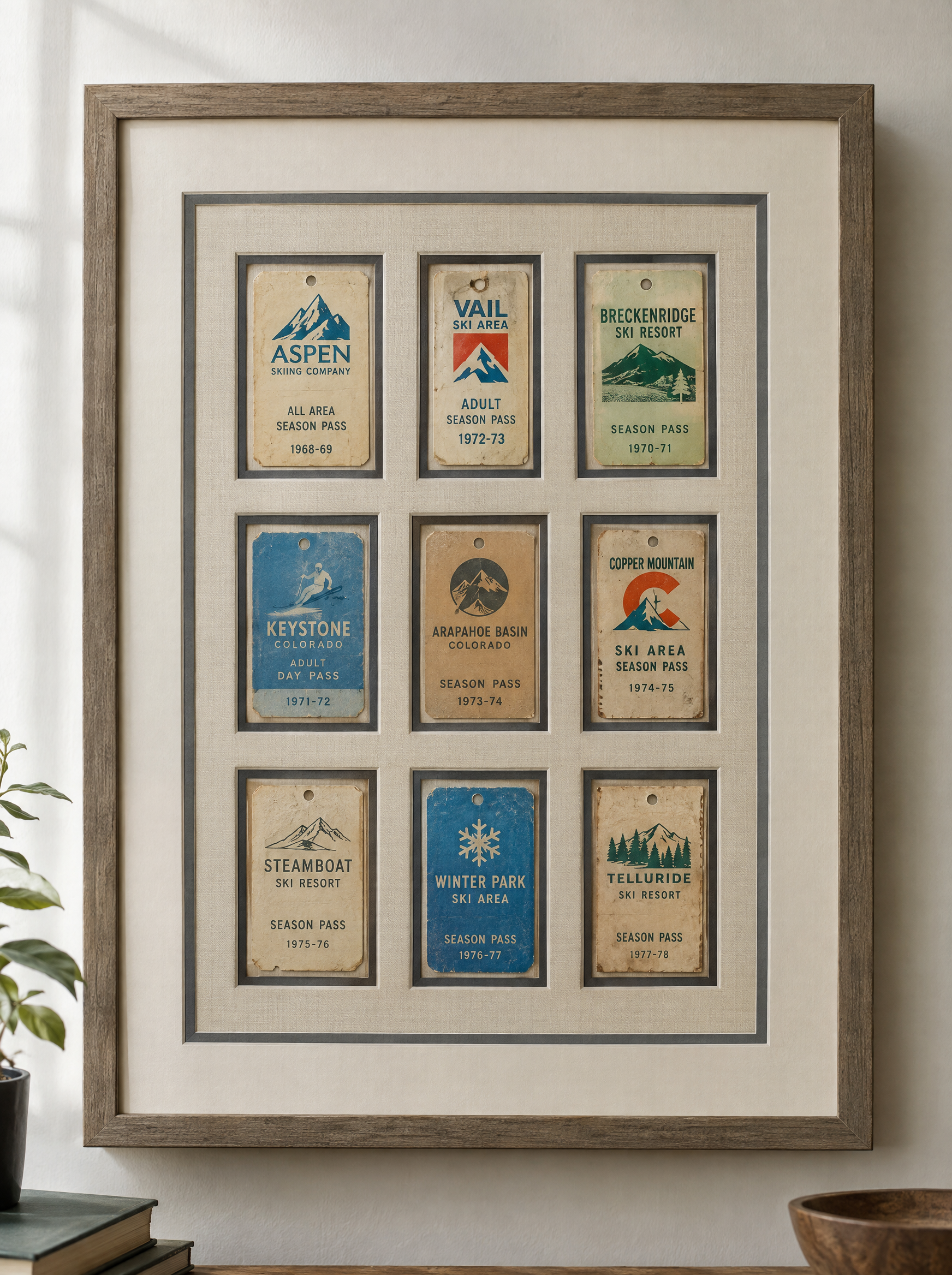
A second mat can create a fine accent of color and add depth around an image. This can be beautiful when the inner reveal is restrained. It may be particularly effective when a small secondary tone from a print deserves acknowledgment, or when the room calls for a subtle transition between art and frame.
More layers are not automatically more luxurious. Multiple borders, contrasting colors and decorative details can compete with an intricate image. Compare a simple single mat against one considered double-mat option. Choose the treatment that makes the artwork feel more compelling from normal viewing distance, not simply the one with more pieces.
Bring samples into the final decision
The surrounding room matters, but the mat should still belong to the artwork. Consider nearby wall color, light conditions and neighboring frames while resisting the urge to chase a temporary trend. A frame that looks understated today is often one that has allowed the artwork's own texture, marks and colors to lead the design.
At Masten Fine Framing in Greenwood Village, a useful custom-framing conversation begins with the actual piece and how you hope to display it. Bring the artwork, share any information about its condition, and explain whether appearance, preservation or a particular location is the highest priority. Comparing real mat and moulding samples makes the decision more grounded than guessing from a digital mockup.