Understanding the Unique Challenges of Vintage Posters
Vintage posters often carry historical and artistic significance, making their framing a delicate task. Unlike modern prints, these pieces may have faded colors, textured surfaces, or subtle imperfections that contribute to their charm. Overly bold frames or reflective glass can draw attention away from the poster’s details, while poor matting choices might clash with its aesthetic. The goal is to create a presentation that complements the poster’s era and design while protecting it from environmental damage.
One common challenge is deciding how much the frame should ‘speak’ for itself. A heavy, ornate frame might overwhelm a minimalist poster, while a sleek, modern frame could feel incongruous with a vintage design. Striking the right balance starts with understanding the poster’s visual language and the role the frame will play in its display. This involves thoughtful consideration of color, material, and scale in relation to the artwork.
Choosing the Right Matting for Visual Harmony
Matting serves both a functional and decorative role in framing. A well-chosen mat can create breathing room around the poster, preventing it from appearing crowded, while also tying the piece into its surroundings. For vintage posters, neutral tones like warm white, off-white, or light gray are often safe choices, as they avoid competing with the artwork’s colors. However, a bold mat in a complementary hue can also enhance the poster’s vibrancy if used sparingly.
The width of the mat is equally important. A narrow mat (around 2–3 inches) works well for posters with intricate details, as it minimizes visual clutter. Wider mats can help anchor a poster in a large space but may dilute its impact if overdone. Acid-free mats are essential to prevent chemical reactions that could damage the poster over time. Consulting with a professional framer can help you weigh these tradeoffs based on your specific piece.
Glass and Glazing Options: Protection vs. Clarity
The type of glass or glazing used can significantly affect how a vintage poster is experienced. UV-protective glass is highly recommended for preserving colors and preventing fading, especially if the poster will be displayed in a sunny room. However, some UV glass can slightly mute the poster’s vibrancy, which may be undesirable for pieces with already faded hues. Non-reflective or low-reflective glass can reduce glare but might also alter the perceived sharpness of the image.
Another consideration is the weight and thickness of the glazing. Heavier glass adds a sense of permanence but can make the frame feel more imposing. For lightweight or fragile posters, a thinner, tempered glass option might be preferable to avoid putting pressure on the artwork. Balancing preservation needs with visual clarity is key to maintaining the poster’s integrity while ensuring it remains engaging to view.
Frame Style and Material Considerations
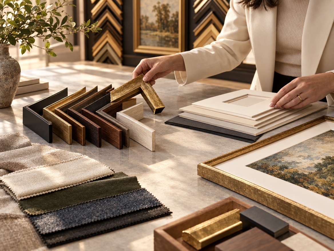
The frame’s style and material should reflect the poster’s character without overshadowing it. For example, a poster with Art Deco typography might pair well with a sleek, black metal frame, while a botanical print could benefit from a warm, natural wood frame with subtle detailing. Modern frames often use minimalist profiles, whereas traditional frames might incorporate decorative moldings that echo historical aesthetics.
Material choices also impact durability and maintenance. Wooden frames offer a classic look but may require periodic polishing, while metal frames are more resistant to warping. Composite materials provide a middle ground, combining stability with customizable finishes. Ultimately, the frame should act as a silent partner, enhancing the poster’s presence without competing for attention.
When to Seek Professional Guidance
Given the complexities of framing vintage posters, many collectors turn to professional framers for tailored advice. Experts can assess a poster’s condition, recommend archival-quality materials, and suggest custom solutions that align with both preservation goals and aesthetic preferences. In Greenwood Village, Colorado, Masten Fine Framing offers custom framing services that prioritize both craftsmanship and attention to detail, ensuring your poster is presented to its best advantage.
Professionals can also help navigate tradeoffs, such as whether to prioritize UV protection over image clarity or how to balance frame weight with room decor. Their experience with diverse art forms and historical pieces makes them valuable partners in achieving a framing solution that honors the poster’s legacy while making it a focal point in your space.