Choosing the Right Mat for Black-and-White Photos
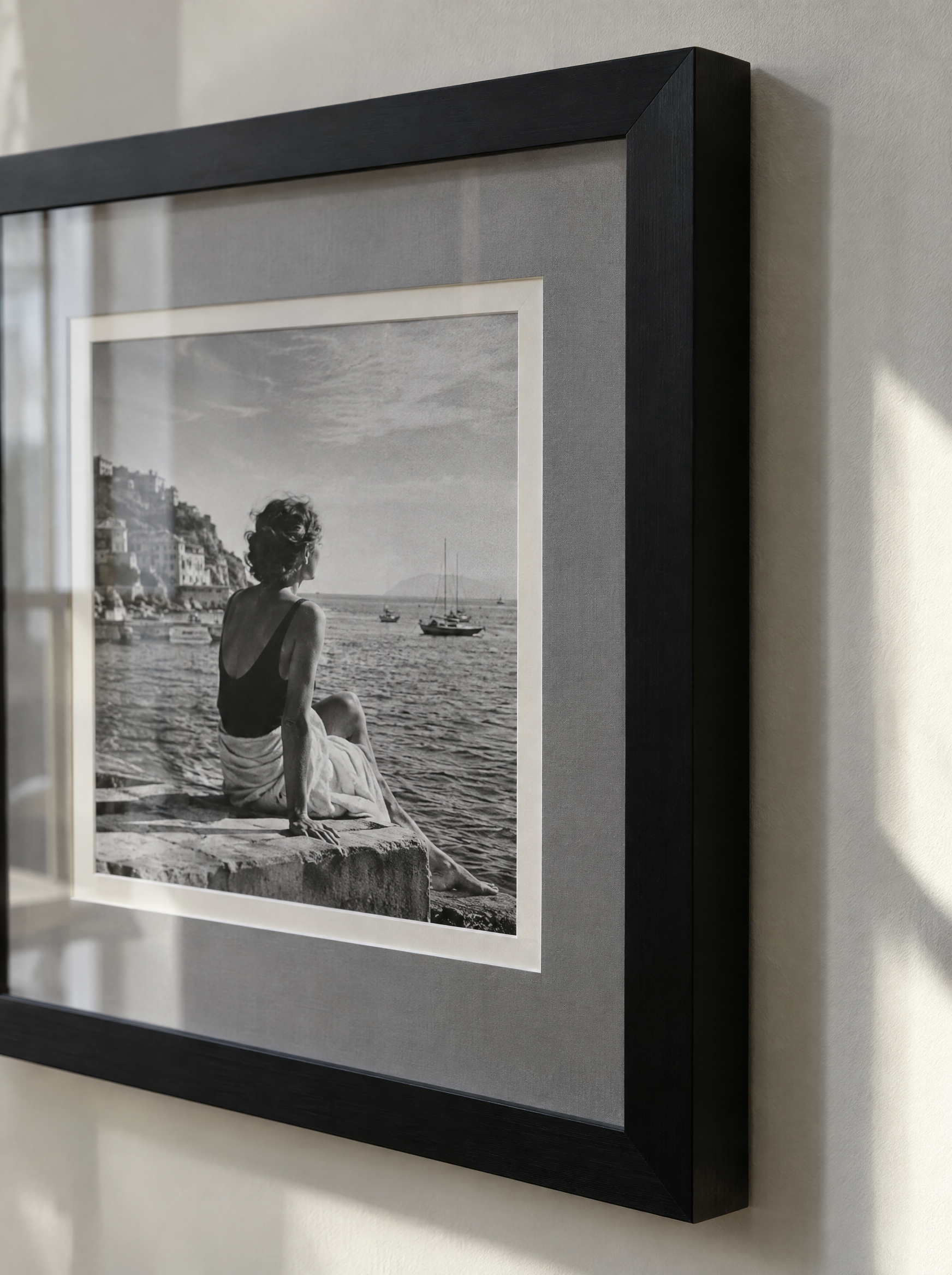
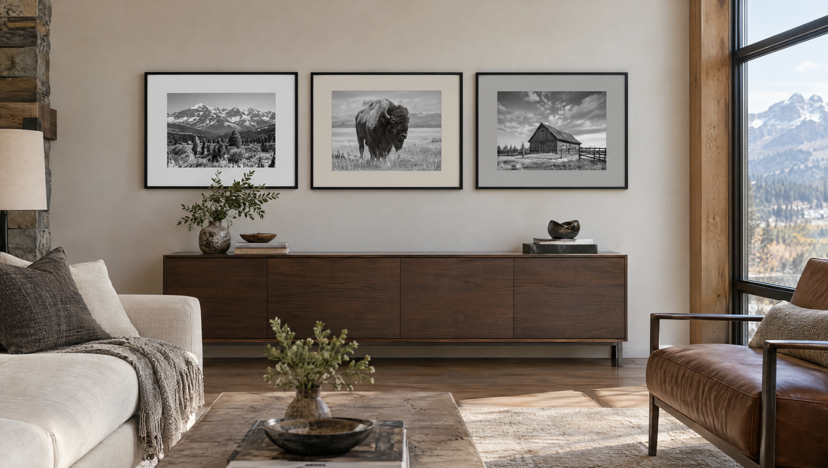
The mat serves both a protective and aesthetic function by separating the photograph from the frame and drawing attention inward to the image. For black-and-white photos, neutral mats like whites, off-whites, and light grays are popular because they preserve the photograph’s tonal subtleties without competing visually. However, subtle colors—such as a very pale warm gray or soft cream—can also add dimension if they complement the photo’s elements or desired mood.
Consider the mat’s texture and thickness as well. A smooth, museum-quality cotton rag mat will minimize chemical reactions and yellowing compared to standard cardboard-based mats. Thickness affects visual depth; a wider, thicker mat can provide a confident border that enhances photo impact, especially in galleries or modern interiors. When consulting with a framer in Greenwood Village, bring your print and discuss how different mat samples look with natural and artificial light, as this can affect color perception.
Finish Styles: Glossy, Matte, or Satin?
Finish choice refers primarily to the surface treatment of the photograph print and the glazing, but it also connects to stylistic decisions about how much shine or reflection you want. For black-and-white photography, matte finishes are often preferred because they reduce glare, helping viewers focus on the image’s contrast without distracting reflections. Matte finishes work especially well for textured or fiber-based prints.
Glossy finishes can enhance blacks and whites with richer contrasts and sharper details, but they introduce reflection issues, which might detract in brightly lit rooms or spaces with many windows. Satin or semi-matte finishes offer a compromise by providing some reflection control with moderate contrast enhancement. When framing at Masten Fine Framing, it’s useful to bring your picture’s typical display environment into the conversation, as lighting conditions directly influence the best finish choice.
Glazing Options and How to Protect Your Print
Glazing is the transparent protective layer covering the photo, usually glass or acrylic. The choice of glazing greatly affects both the preservation and viewing experience of black-and-white photographs. UV-filtering glazing is critical for long-term preservation, as ultraviolet rays cause fading and deterioration over time. Both glass and acrylic options exist with UV coatings, but acrylic is lighter and shatter-resistant—good for larger or frequently handled pieces.
Anti-reflective (AR) treatments on glazing significantly reduce glare and reflections, enhancing the display of subtle tones typical in black-and-white images. However, AR glazing tends to be pricier and less widely available, so consider your budget and display conditions. At a framing consultation like those offered by Masten Fine Framing in Greenwood Village, you can view samples of glazing to compare glare levels and color neutrality in person.
Preparing for Your Custom Framing Consultation
Bring your black-and-white photograph and information about its print type (digital, silver gelatin, fiber-based, etc.) if available, as different print processes may have different conservation needs. Also, consider the display space—lighting, wall color, and room style—to discuss framing options that complement the surroundings.
Ask about matboard materials (acid-free, lignin-free, cotton rag), glazing coatings, and frame profiles. Discuss your priorities: whether preservation, aesthetics, or budget is most important. For example, if preserving a rare silver gelatin print is your priority, opt for museum-quality materials and UV protection. Preparation like this ensures the consultation is productive and your framing investment protects and highlights your cherished photograph.
Common Mistakes to Avoid When Framing Black-and-White Photos
One common error is using mat colors that compete with or overpower the grayscale image, such as bold or dark colored mats that distract rather than enhance. Stick to subtle neutrals or carefully chosen pale tones.
Another mistake is selecting non-UV protective glazing (plain glass or acrylic). Without UV protection, black-and-white prints can yellow and fade with light exposure, reducing their longevity dramatically.
Finally, neglecting to consider the lighting environment can lead to excessive glare or darkening if the wrong finish or glazing is chosen. Always evaluate where and how the piece will be displayed before finalizing glazing and finish decisions.